08/22 | Opinion
Everything is a remix: 6 nostalgic design trends to inspire your creativity today
You may have heard the term ‘everything is a remix’.
What probably springs to mind first is music. Beats, rhythms, lyrics and samples are remixed all the time. But as this documentary explains, remixes are everywhere. From blockbuster movies, to everyday household objects, to fashion and design. Trends and innovations are often recycled and used to inspire new creativity.
In this blog, we’ll take you on a nostalgic journey through some sentimental design trends that harness nostalgia.
Why is nostalgia so effective in branding and design?
Nostalgia: A sentimental longing or wistful affection for a period in the past. Some of these design trends may transport you back to simpler times of the past.
Nostalgia appeals to audiences on an emotional level, tapping into their connection and familiarity with a past era. But that sentimental value can inspire new ideas and thought processes that resonate with modern audiences. Revising old styles and trends can influence your design whether that’s a logo, a website, social media or even finer details such as colourways and typography. Let’s transport ourselves back through time and see what we can learn from some of the most influential and nostalgic design trends of the past.
1. Vintage photography
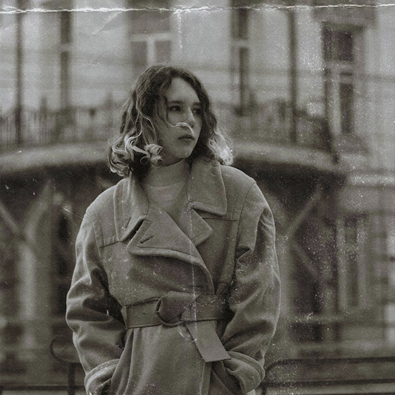
We’re so used to seeing filtered, edited and, high-quality images across adverts and social media, that we forget the times of grainy, black and white, raw photography.
But many brands use vintage photography in their campaigns to connect with audiences and engage with them on a more personal level. In an era of visual and photographic content, this trend is especially effective across social media platforms, where some brands even encourage audiences to share their nostalgic photos from their past. We’ve seen this strategy used by brands such as Expedia in their ‘Travel nostalgia with Expedia’ campaign, where they encourage users to come forwards and share their ‘throwback’ photos of past travels and trips. The sentimental value was unmatched. By prompting users to share a small blurb about the photo, this was a sure-fire way to connect emotionally with their audiences and harness that feeling of nostalgia, bypassing traditional marketing methods.
There is a huge market for vintage cameras and photography now, so consider using this method in your next campaign or as an ongoing creative device if it connects with your audiences in a meaningful way.
2. Graffiti
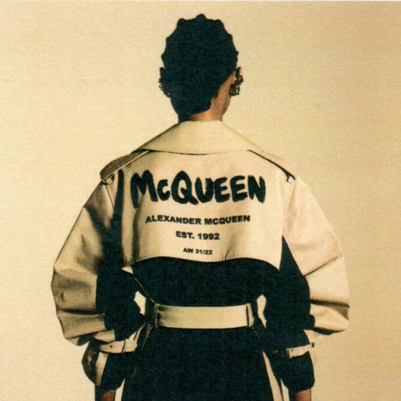
Street art became mainstream during the 90s, and audiences who grew up during this era can feel nostalgic about iconic graffiti trends. We’ve seen characteristics of ‘graffiti-style’ typography used by iconic brands, most notably, Alexander McQueen. Ahead of the AW21 launch of the McQueen Graffiti collection, the brand used signage and vehicle wrapping to generate exposure for the collection. The rough and edgy graffiti font is the centrepiece of the clothing collection.
3. Retro
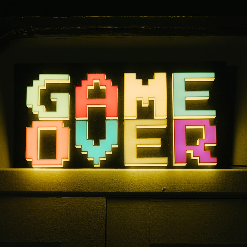
Making a nod to retro products, fashion trends or colourways in your design is likely to help you stand out over competitors. Not only does it carry with it an element of personality by exploring bold, bright colours, and psychedelic patterns, but, as predicted by The Design Nest, we should expect to see an uprise in retro creative during 2022.
We often see old styles and trends recirculate in later years, so opting for a retro design can, ironically, help you appear ahead of the trends.
4. Pop art
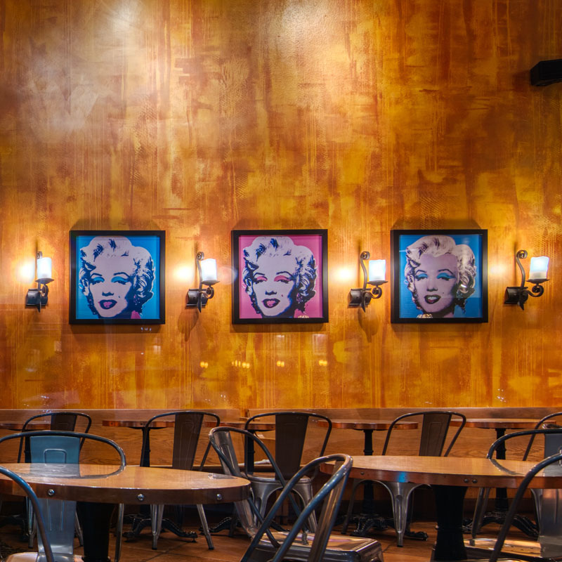
Pop art feels like a part of modern life since we’re so used to seeing fragments of it weaved into modern design. But it actually emerged in the mid-1950s in Britain, and late 1950s in America, peaking in the 1960s. Appealing to Gen X or baby boomers, consider pop art nuances to add character, personality, or even inspire fonts and type styles.
5. Old school packaging
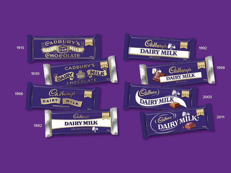
For some reason, it’s so irresistibly shareable when a brand shares its old packaging or branding from a previous era. A way of saying to your followers – look, do you remember this too?! Perhaps it can elicit positive and fond memories of the past, or draw comfort in reliving those memories by continuing the exposure of those images.
Just look at this campaign by Cadbury released in South Africa, celebrating 80 years of Cadbury by showing the iconic packaging designs through the years. Whether you remember the Cadbury wrapper of the 60s or the noughties, this image will evoke memories and likely engage with audiences on an emotional level across a large demographic. Cadbury knows their product, and generally speaking, chocolate is a symbol of affection, love – a treat. We rarely associate chocolate with negativity, right?
6. Bold geometrics
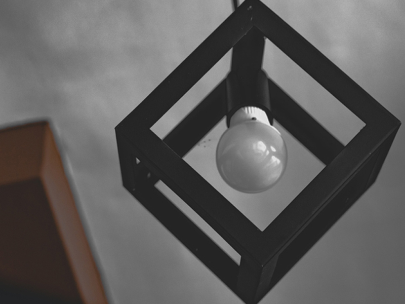
Originating in the 1940s, bold, geometric patterns were usually seen around the house. The most popular display was tiling and flooring in the kitchen. Bold prints were used as a way of punctuating otherwise bland, wooden furniture, and adding a pop of colour to the home.
Geometric patterns are often used to complement more contemporary designs and have been recycled time and time again. Their popularity in modern design can be attributed to their ability to subtly lift a simplistic or minimalist design. Logos, business cards, or mailers can benefit from a hint of bold geometrics without overpowering a design.
Sometimes a look back over the past can inspire and recharge your creative juices. The idea is to remix. Blending contemporary with vintage is nothing new, but it can spur on unique designs that elevate you above competitors and resonate with wider audiences.Thinking about a rebrand? Get in touch with a member of the team and let’s talk strategy and design.
