Designing for large format print – think huge banners, massive billboards, or tricky shop window vinyls – they can create a big impact, but you need to follow a few simple rules. These guidelines will help make sure your final installation is top-notch and really grabs attention.
Jack Warner, Design Lead at Stratos, reveals his seven top tips when designing large format print.
High quality content
The foundation for creating stand-out large format print designs is making sure the assets we’re working with are of the highest possible quality. The biggest challenge is getting the right assets from our clients, but we help you to identify content that will be the correct size, file type and artwork style.
For graphics that will be enlarged significantly, such as logos or illustrations, they must be supplied as vector-based files, so they don’t lose quality when they’re printed in large format.
For those really massive prints – 10 to 20 meters wide – we recommend designing at 25% or sometimes 50%. This is because, while the pixels will be very large, people will only ever view the print from a significant distance, so it won’t appear pixelated at range.
Print materials
The material that your large format design will be printed on plays an important role in how the creative is set up and how the final design will look when it’s in situ. It’s important to be aware of the effect that different lighting, environments and materials can have on your large format print design.
A crucial challenge is understanding the final installation of your print, and communicating with stand-builders or installers to ensure that our designs will line up correctly and any stretched material will still be straight when it’s installed. This is another reason why gathering the correct assets from our clients is essential, as we need plenty of margin to prevent essential artwork from being cut off when the final product is displayed.
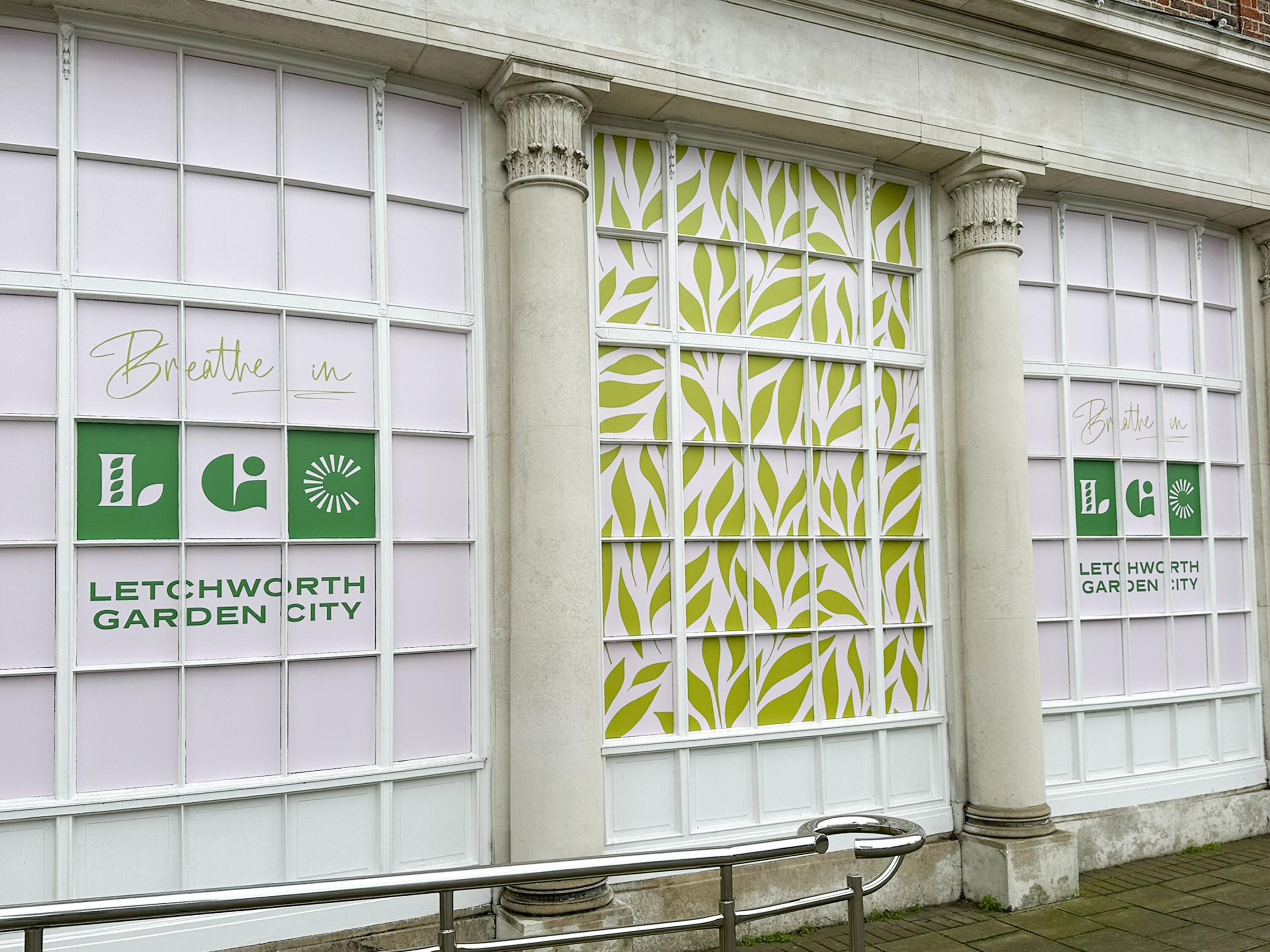
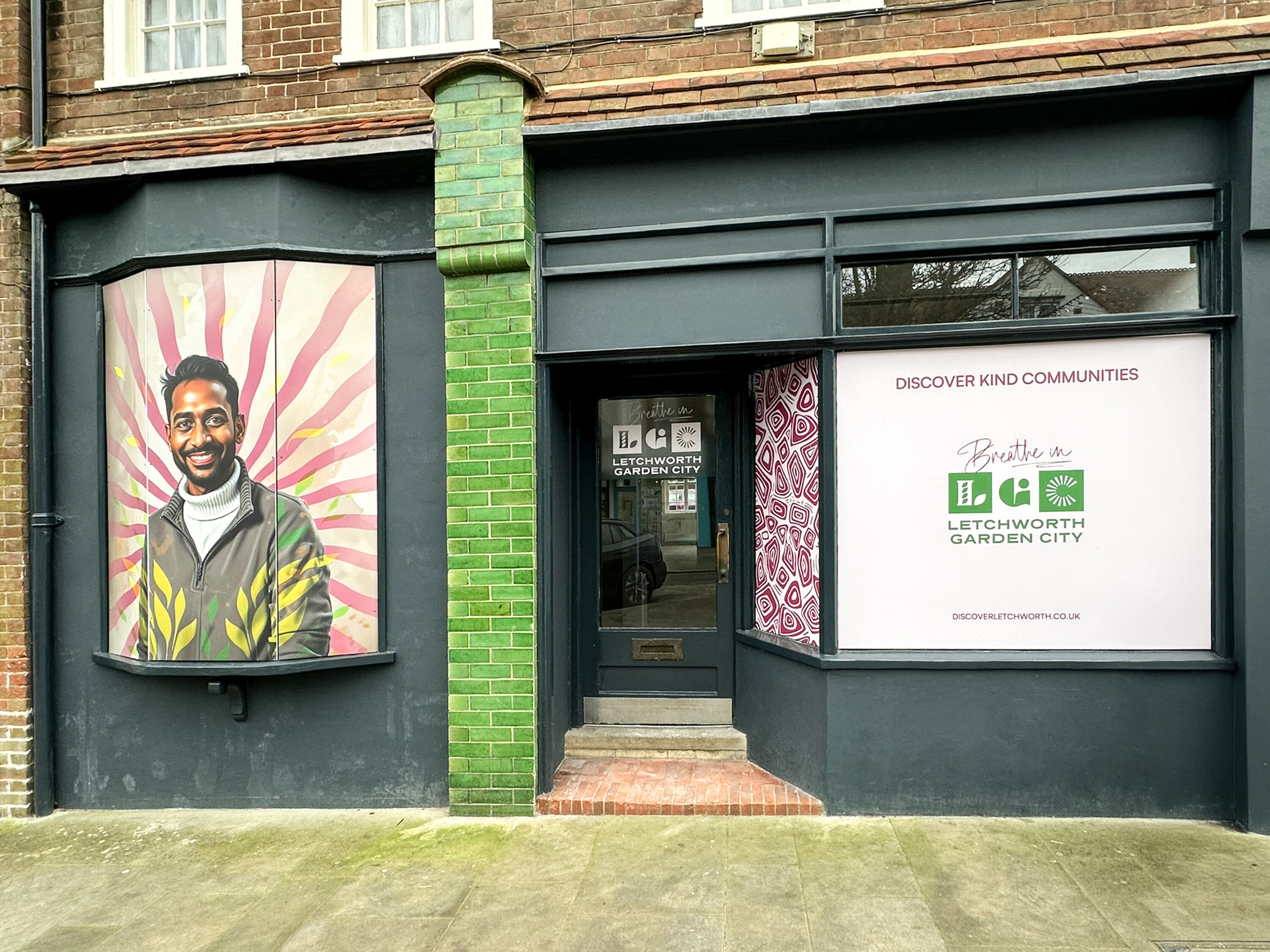
As part of our placemaking project with Letchworth Garden City, we created large format designs for installation in empty retail units across the town centre. We were tasked with creating a window display for an old bank, with windows made up of 64 small panes of slightly concave glass. Putting text that would be legible on the panes was impossible, so we knew that this particular window couldn’t follow the same design approach as the other windows that were part of the campaign.
After some experimentation and lots of communication with our installation partners, we found a solution that ran an oversized logo across the panes, alongside an ambiguous leaf pattern, which was part of the brand identity for the project. The print solution was key, with the design printed onto small, slightly perforated stickers, which meant that if the installer was slightly off, they could easily peel the sticker off and realign it. The stickers were small, but when you stepped back onto the street, the overall window display was highly impactful.
Colour management
Did you know that the material you choose to print on will have a significant impact on the colour of your final display?
Different materials; soft, hard, shiny, matte, hit the ink differently. Our job is to make sure our clients are aware of how your brand colours will look once printed. It’s all about knowing the environment, for example if your print is for a window graphic going on the inside of glass, the colours will be slightly muted.
We feel it’s important not to deviate from our client’s brand colours, especially for hero assets, such as logos. We prioritise communicating with you to ensure you’re fully aware of how the final design and colour will look, depending on the print materials that you’ve chosen.
Typeface and fonts
When creating your design, we consider how the user will be viewing it in print. If a person is walking past or is far away they may only take a quick glance, making typeface and font legibility vital.
Contrasting colours are also essential for readability, especially for people with impaired vision. We suggest printing out a smaller version of your design and asking someone entirely removed from the project to point out what information stands out the most. If your design doesn’t work in small print, it definitely won’t work in large format.
Copy
Your copy for large format print must be concise, with clear brand messaging and/ or calls to action that will attract the attention of people passing by.
The shorter the copy the better, a two word statement can be very impactful, especially with supporting images. Read out loud what you’ve written and consider if someone walking past will have time to digest it.
The shorter the copy the better, a two word statement can be very impactful, especially with supporting images. Read out loud what you’ve written and consider if someone walking past will have time to digest it.
The environment
Why is visiting or visualising the environment that your large format print will be installed in important?
Seeing the environment in person will enable you to understand how people move and flow in that space. You can see first-hand how people will interact with your installation, for example when walking down a corridor, sitting in a meeting room, or a fleeting glance from a bus window.
This is beneficial when planning your creative as it allows you to take into consideration different scenarios that could impact your design, such as uneven walls, non-straight stands, or lighting that could impact the readability of your design.
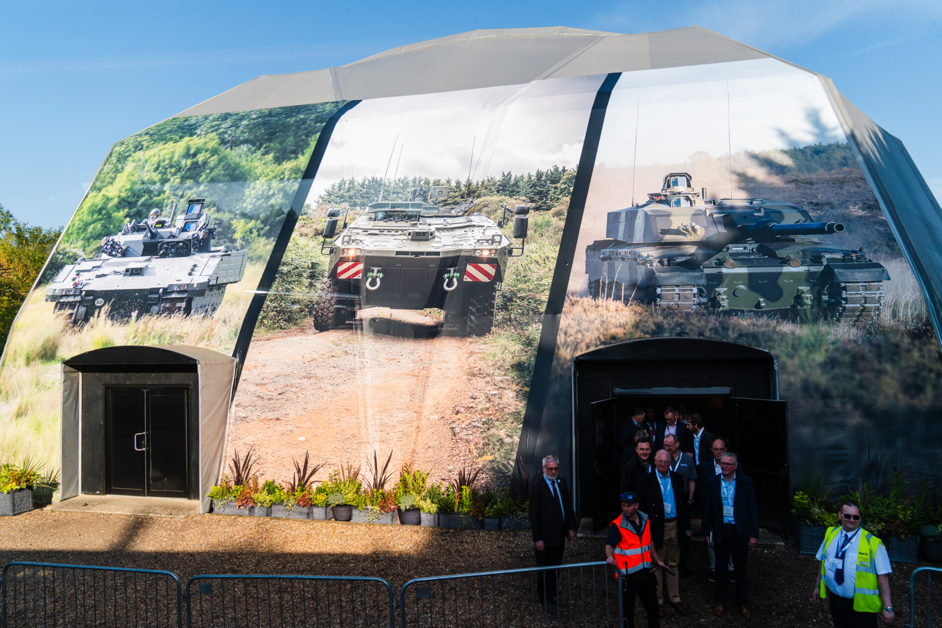
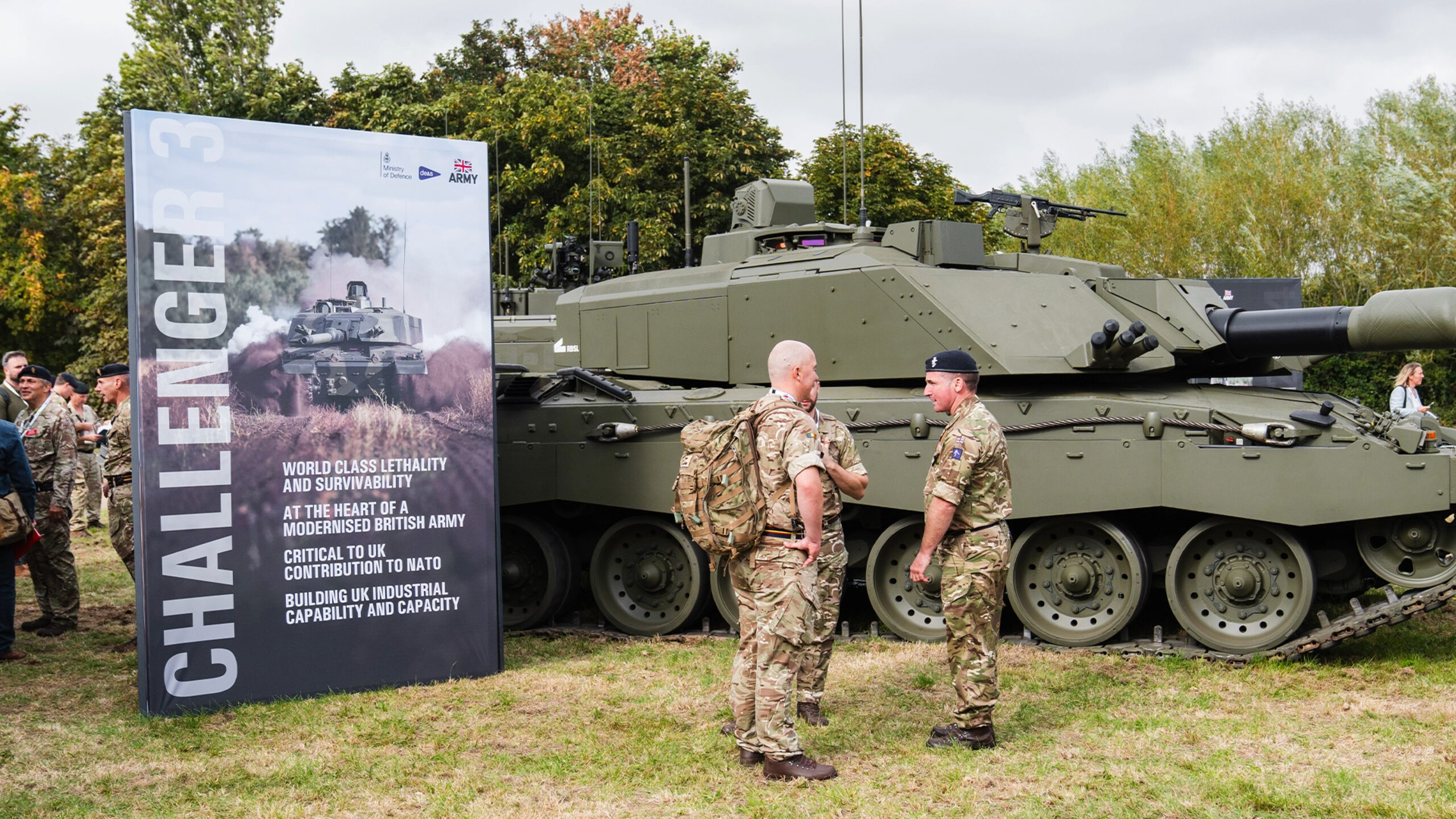
Supporting our clients DE&S, the British Army and UTAC Millbrook at the biennial defence event, DVD2024 we created large format print for 18 individual exhibition stands, as well as a more than 15 meter high and 20 meter wide design on the main event entrance as the 6,000+ guests arrived to the show.
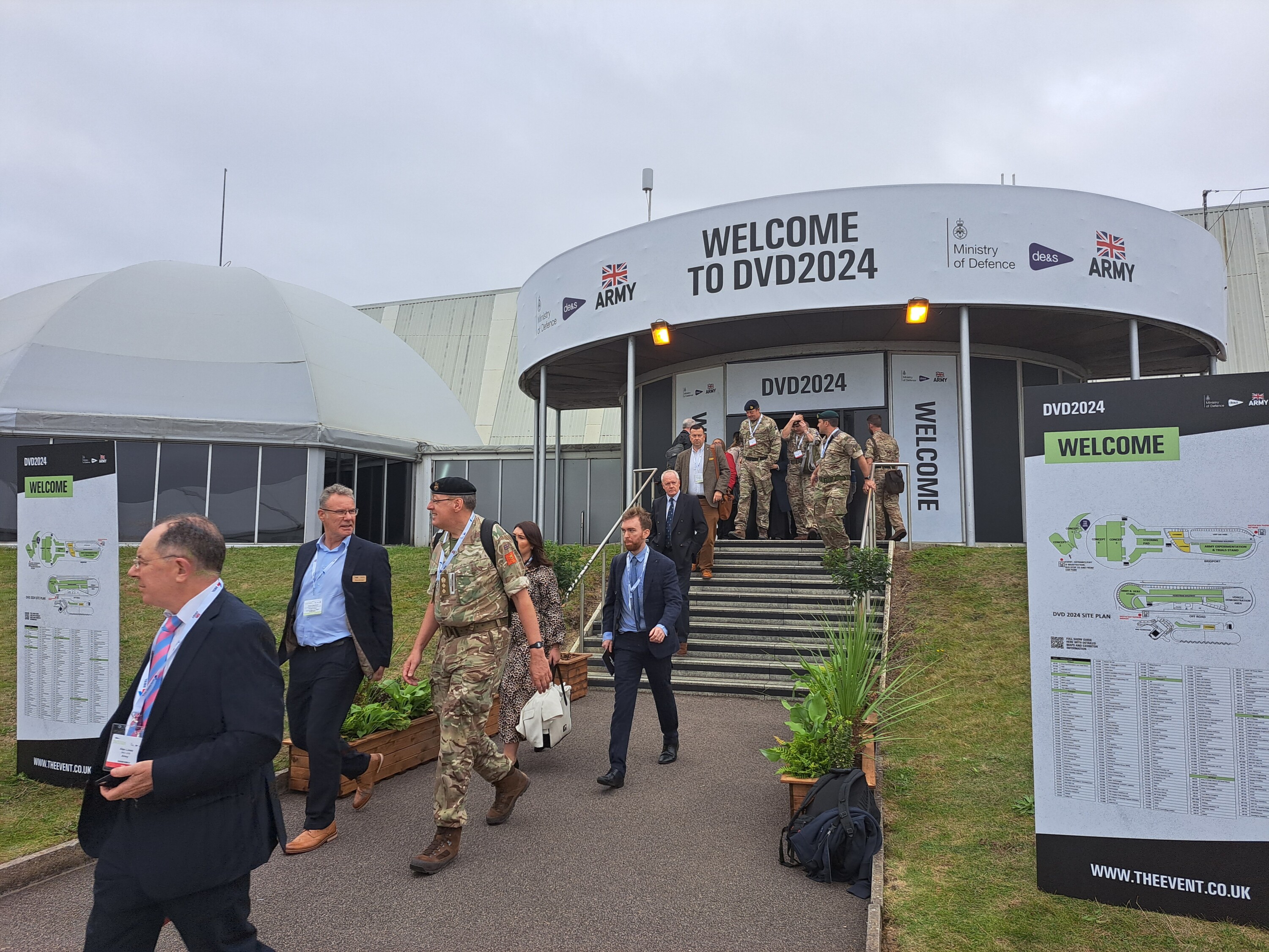
The scale of the building was challenging, particularly with two doorways either side, and we wanted to ensure that we didn’t lose all aspects of the image as you got closer to it. While it looked incredible on the approach from the bus, the closer we got, the less impactful the image became.
We were asked to feature three vehicles, but if we do it again as part of our project work for DVD2026, we will advise the use of one hero vehicle, which will be more impactful to people passing by. It was a new project with nothing to compare it to, but it was a great learning experience, and it’s something we’re keen to improve upon next time.
Accuracy
Since large format printing is a high cost production, it’s important to make sure you get your designs 100% right before anything goes to print.
Unlike digital ads or small flyers, a mistake in large format is extremely expensive and difficult to fix. That’s why quality assets, consideration of print materials, colour management, font, copy and environmental impacts are all non-negotiables for ensuring your final project is perfect and ready for print.
Got a large format print project?
From out-of-home billboards and stand designs, to window vinyls and off-the-scale building designs, we’ve got you.