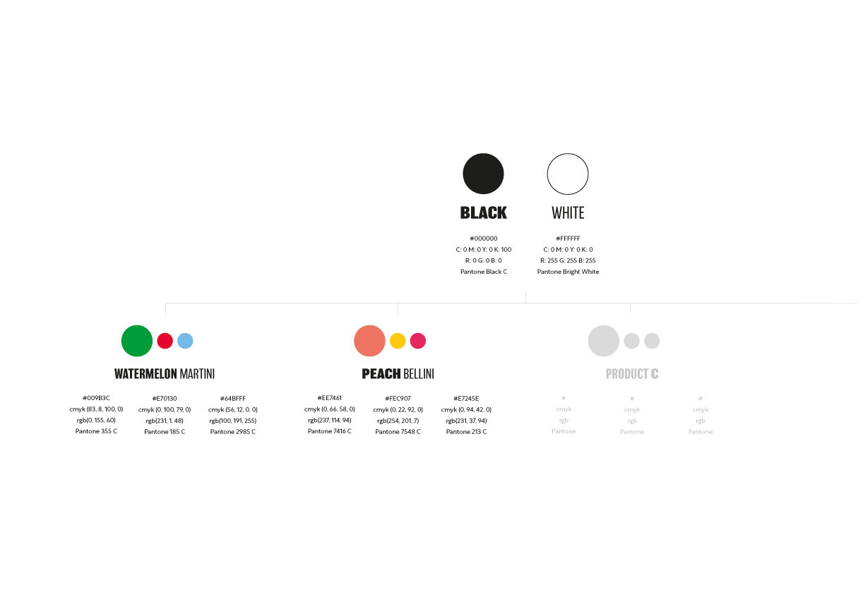
Branding
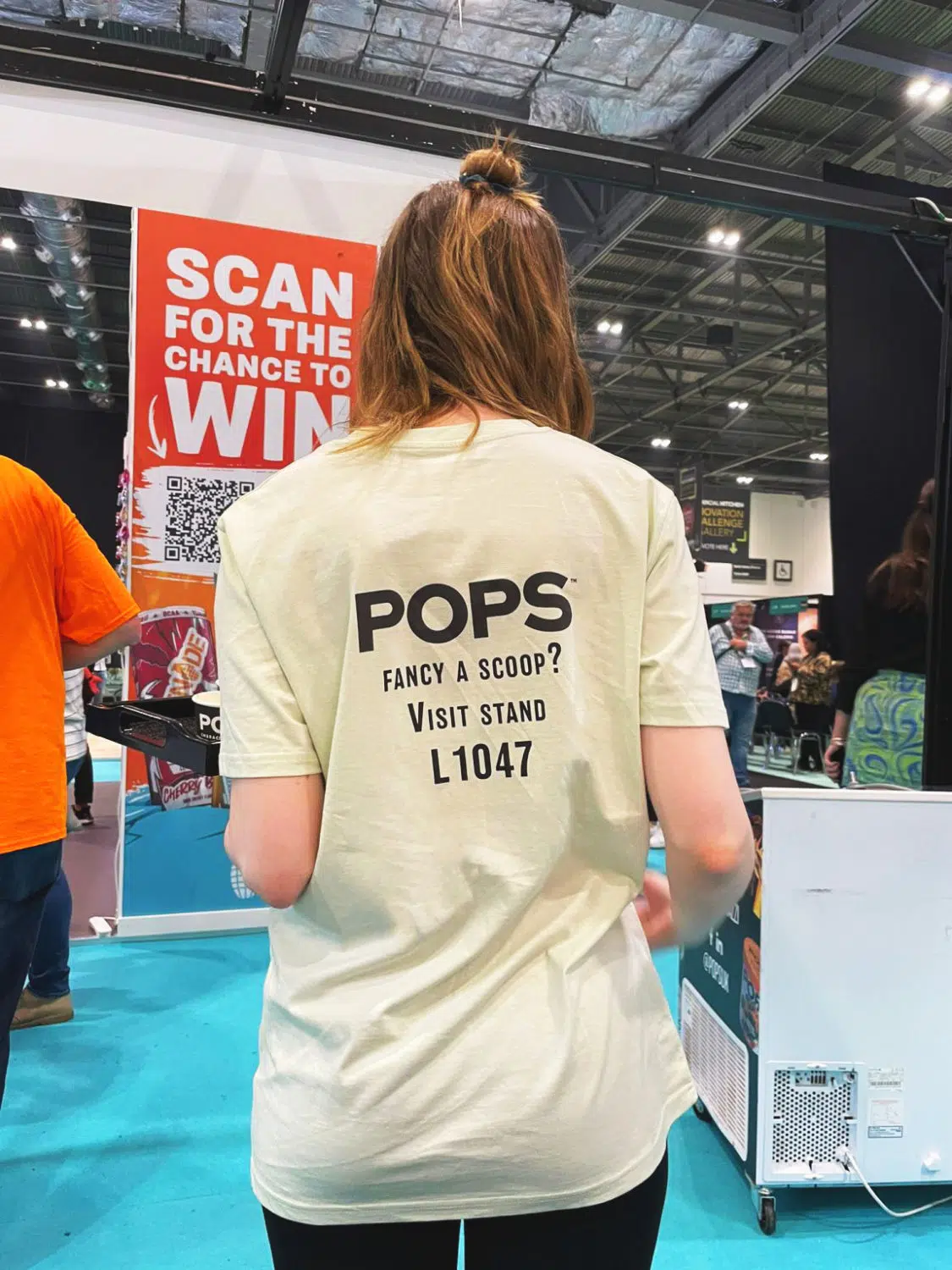
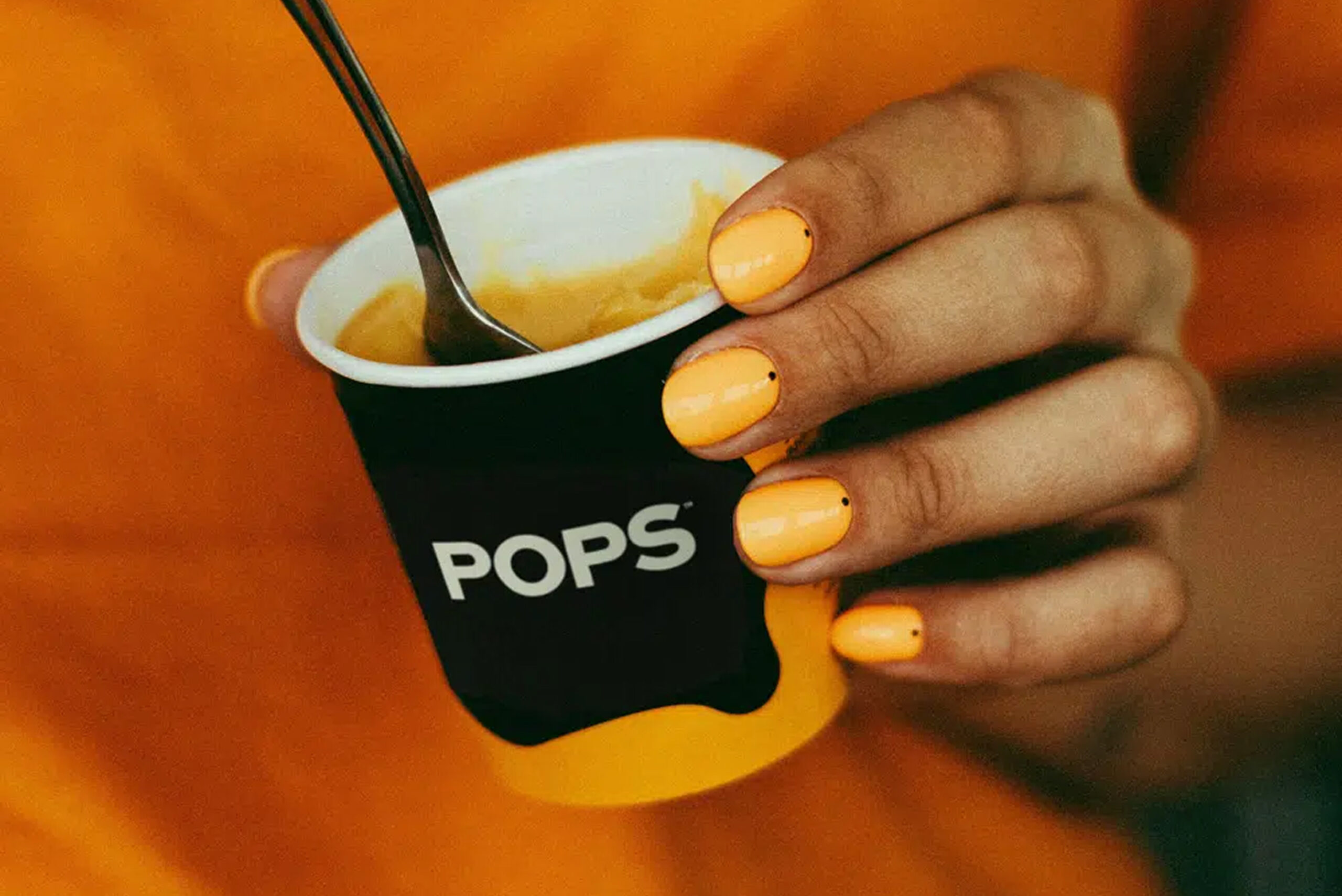
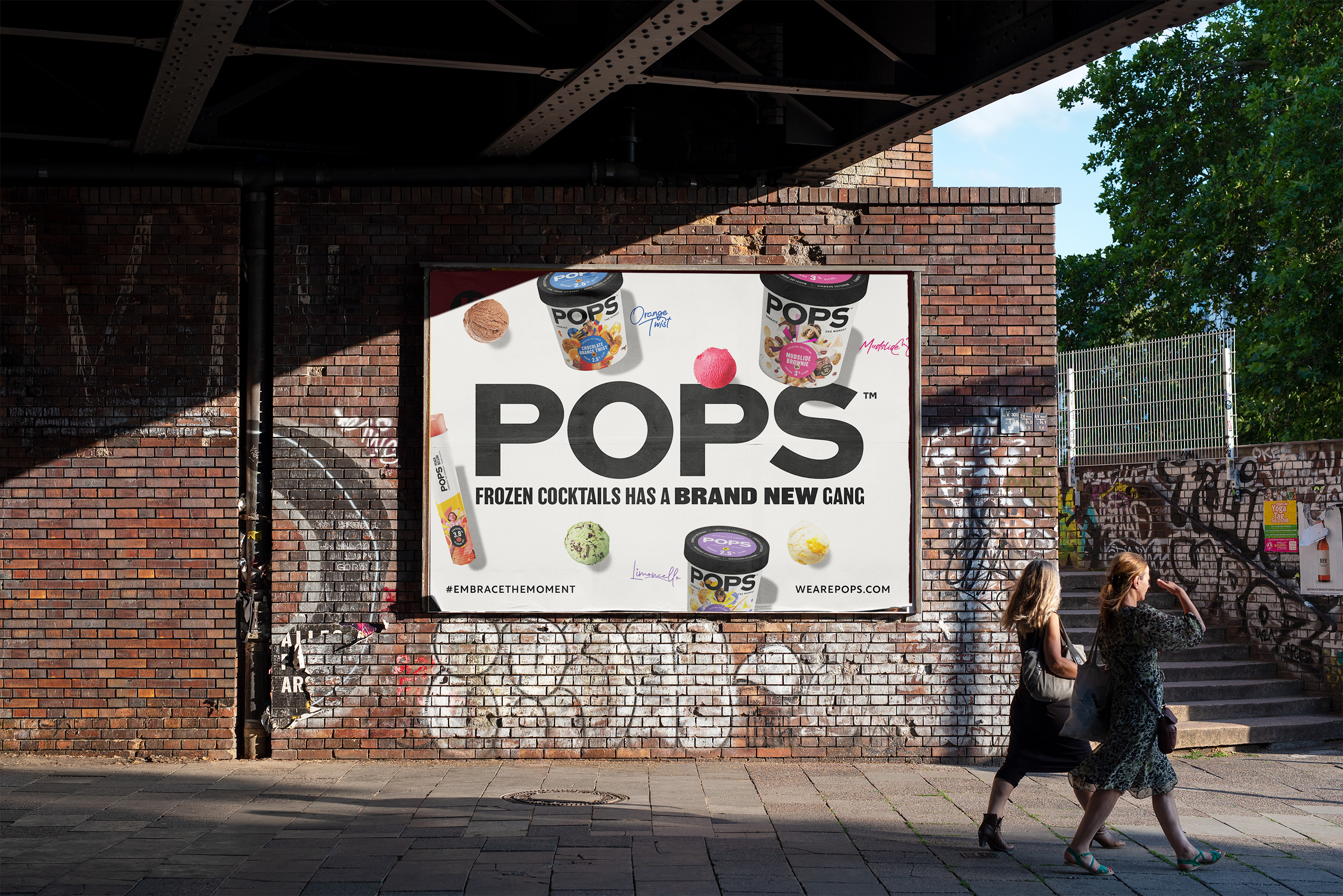
Creative
Campaign
Embracing a brand & enhanced moments.
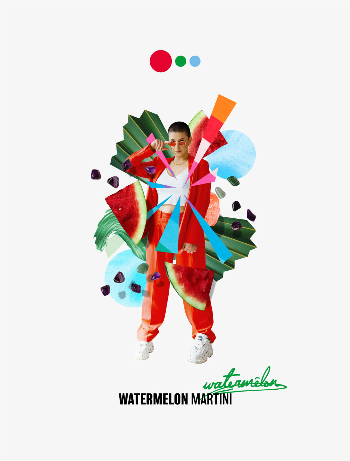
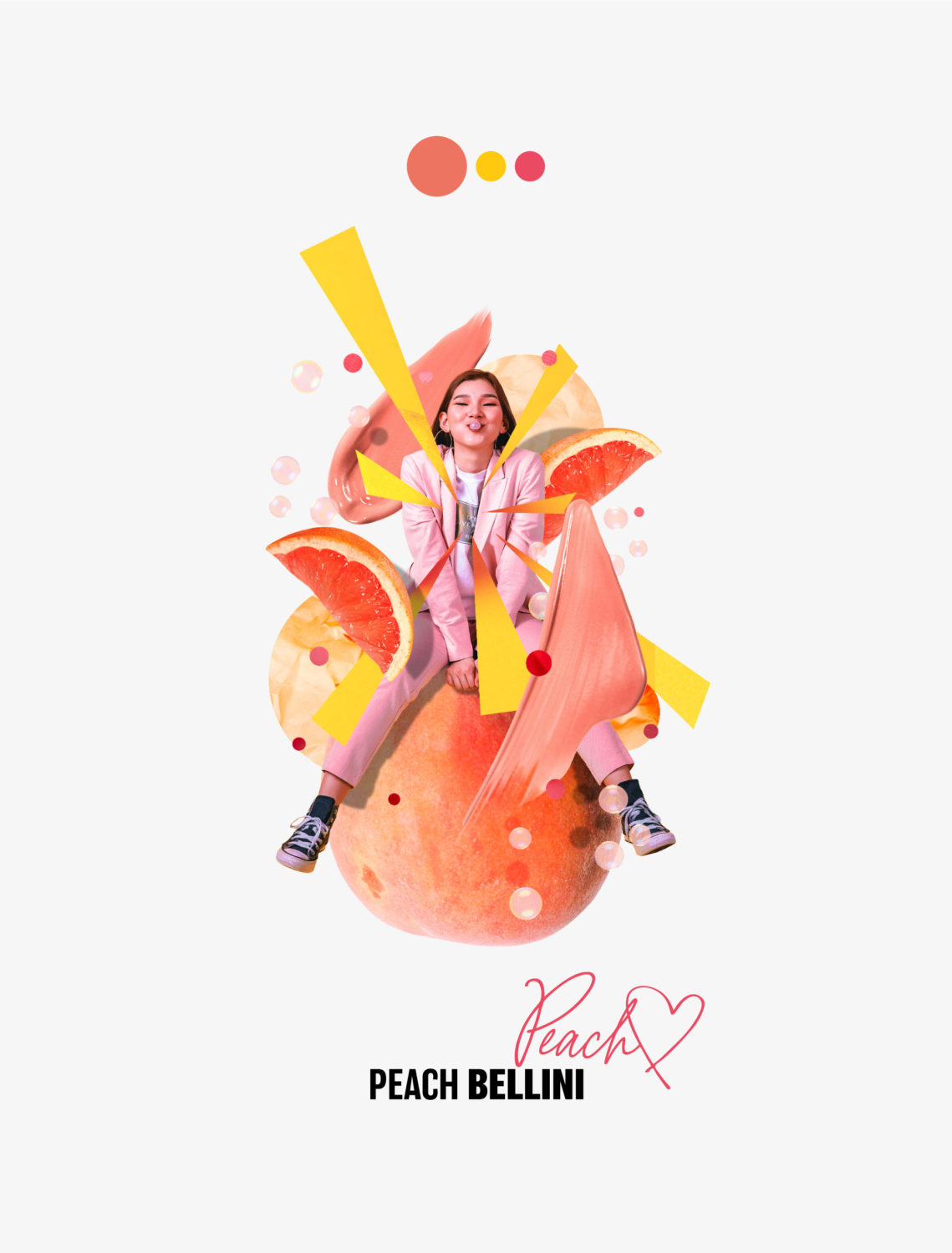
Giving personality to a frozen cocktail brand.
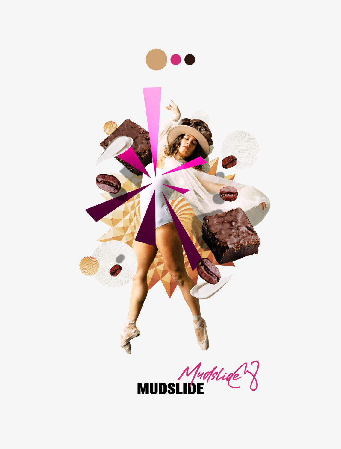
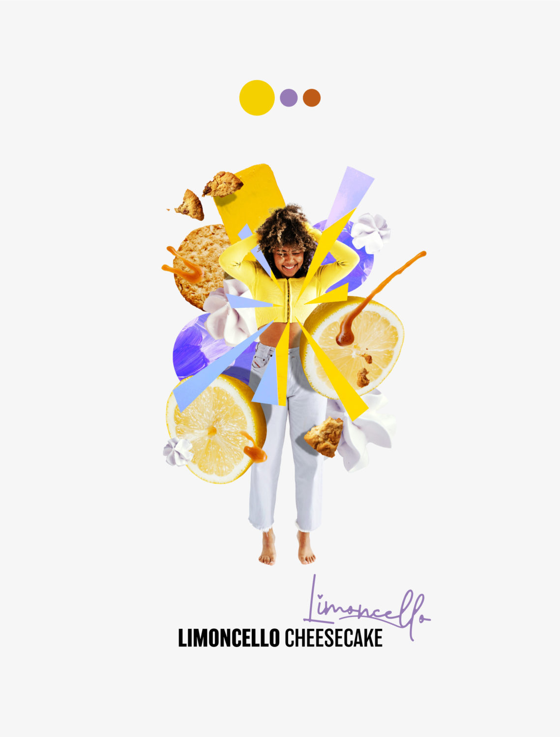
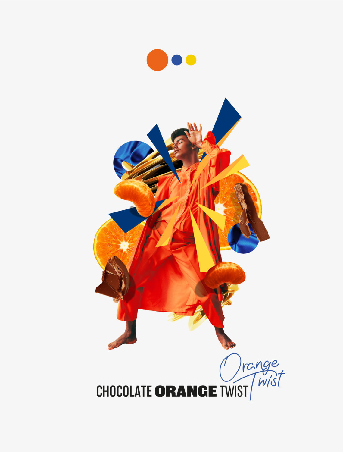
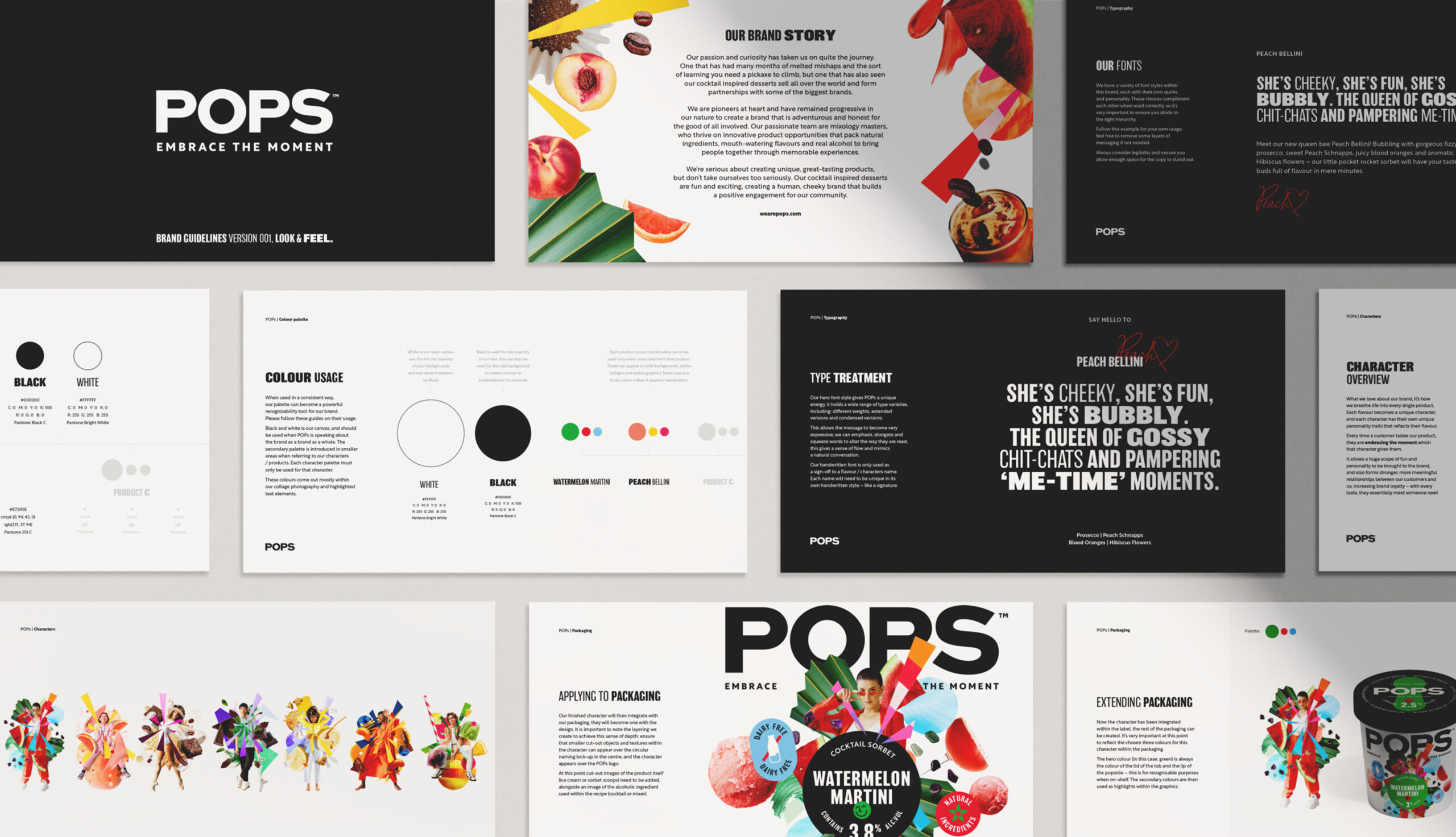
We gave POPS a bold new identity and a brand narrative built around flavour-led characters. Each product took on a life of its own, creating a playful, flexible system that could adapt to new launches and reach new audiences in fun, memorable ways.
Client POPS
IndustryFood & Bev
The challenge
POPS needed more than just a brand refresh; they needed a story that could grow. With new products, new occasions and a wide audience to reach, the challenge was to create something that felt distinct but still held together as one brand.
The Solution
We developed a gang of characters, each flavour with its own personality. We backed this up with a consistent visual system and clear rules to keep the brand tight. From launch events to pop-ups, the identity delivered buzz and built momentum.
“It’s been a pleasure to work alongside the POPS team to give their products a new identity. The personality that’s been injected into the brand is really exciting. Oh, and they taste so good!”
Amy Williams, Account Manager – Stratos
Keep exploring.