Branding
Creative
Digital Marketing
Website
Comms
Reframing the world of law.
Redefining legal services with a brand built on warmth and trust.
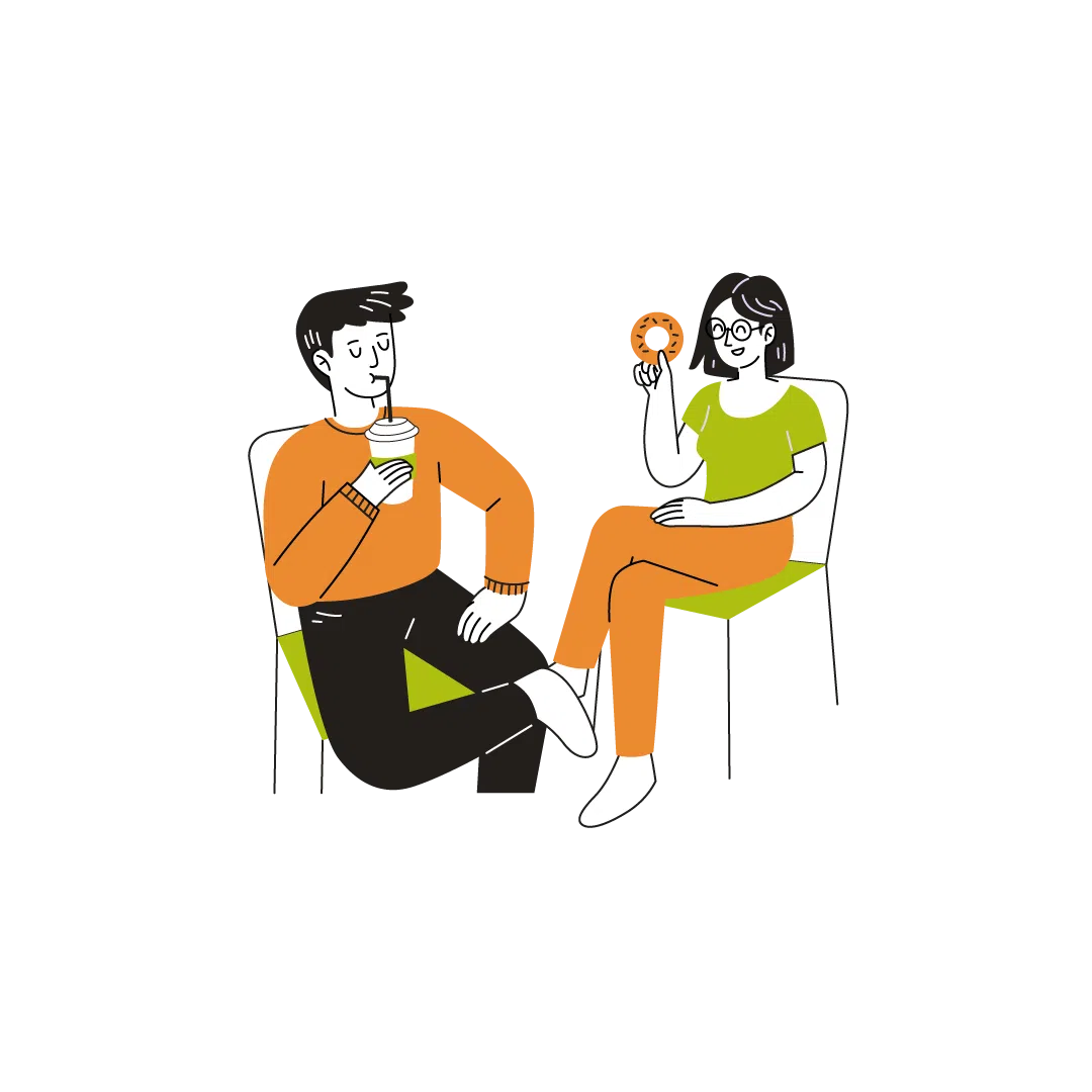
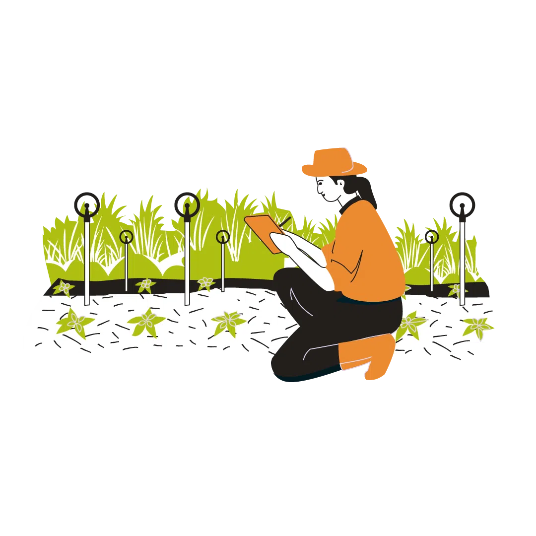
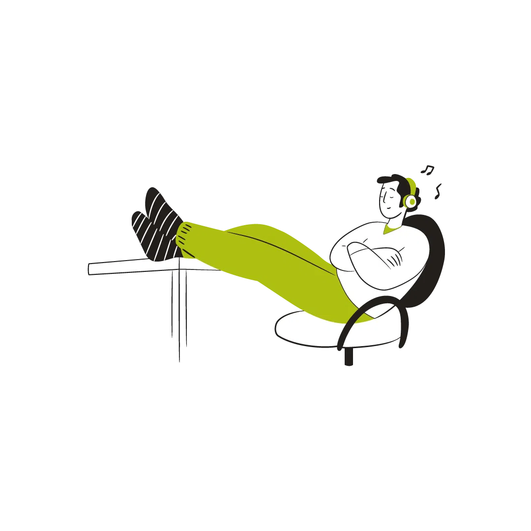
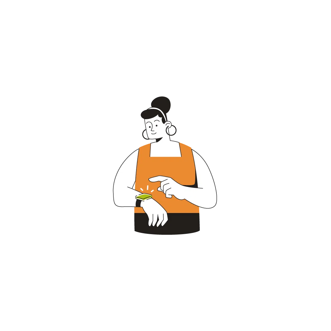
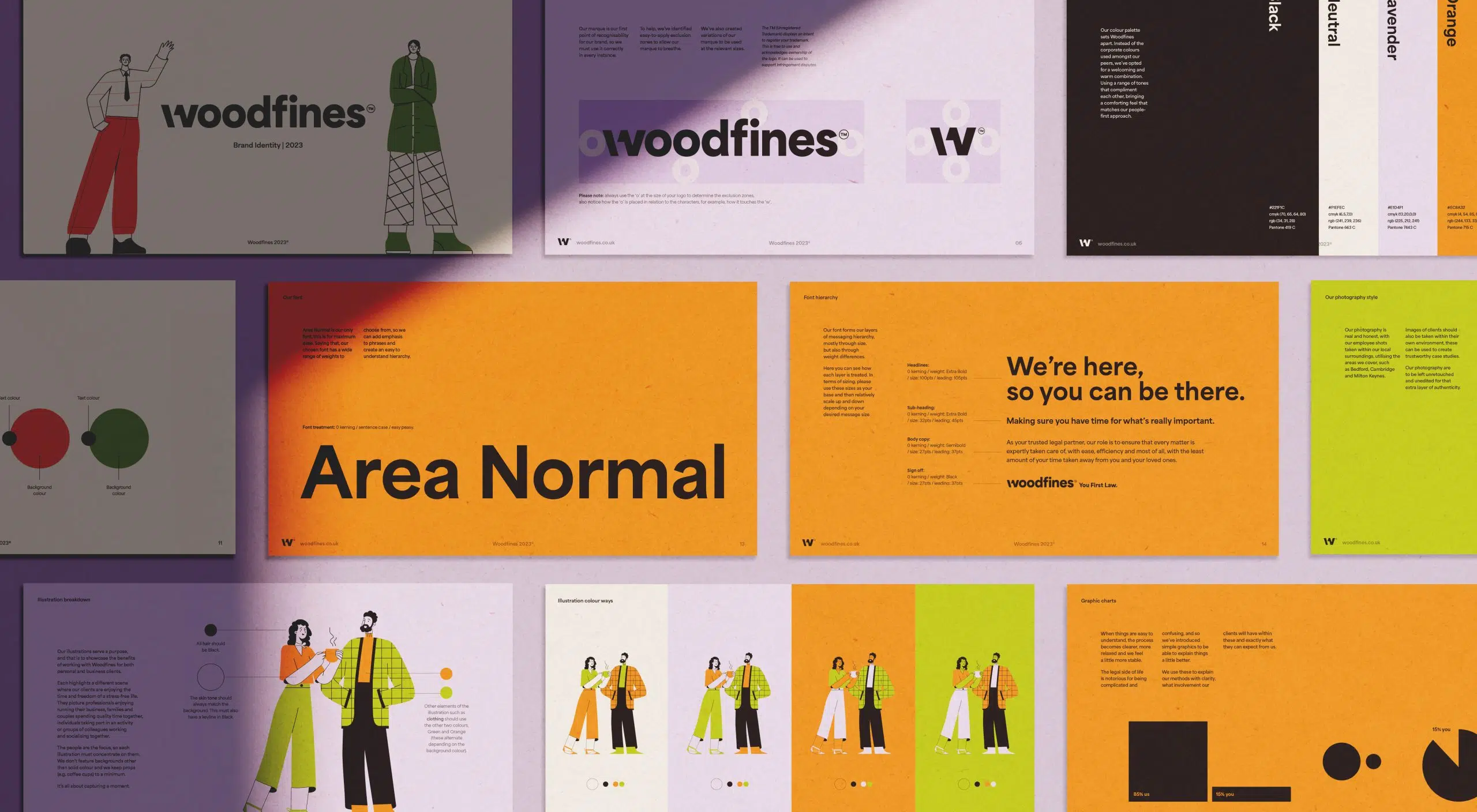
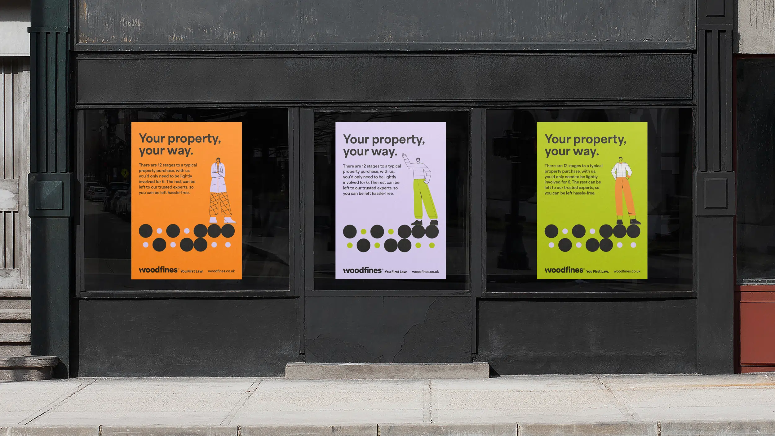
We helped Woodfines reposition their brand to feel less intimidating and more human. From illustration to website, everything was crafted to ease stress, build trust and put people at the heart of the experience.
Client Woodfines Solicitors
IndustryLegal, Professional Services


The challenge
Legal advice can feel overwhelming, even when it’s essential. Woodfines needed to distance themselves from the cold, corporate image typical of the industry and instead connect with clients on a personal, emotional level without losing credibility.
The Solution
We shifted the focus from legal process to life’s big moments, buying a home, growing a business, protecting what matters. Through warm illustrations, an inclusive colour palette, and a brand-new website, we built a brand that breaks the mould and puts people first, always.





A special thanks to
Rebecca, Head of Marketing at Woodfines, for trusting our creative approach. It’s been a genuine pleasure to help bring a bit more warmth and humanity to the legal world.
“This project was so rewarding in the way we could flip the script on legal services. It became more than a brand; it was challenging a very solid stereotype within the industry and we’re so proud to have worked alongside Woodfines on this.”
Marc Smiddy, Creative Director – Stratos
Keep exploring.


