Branding
Creative
Campaign
Shining a light on car care.
Bold design for a meticulous car care brand.
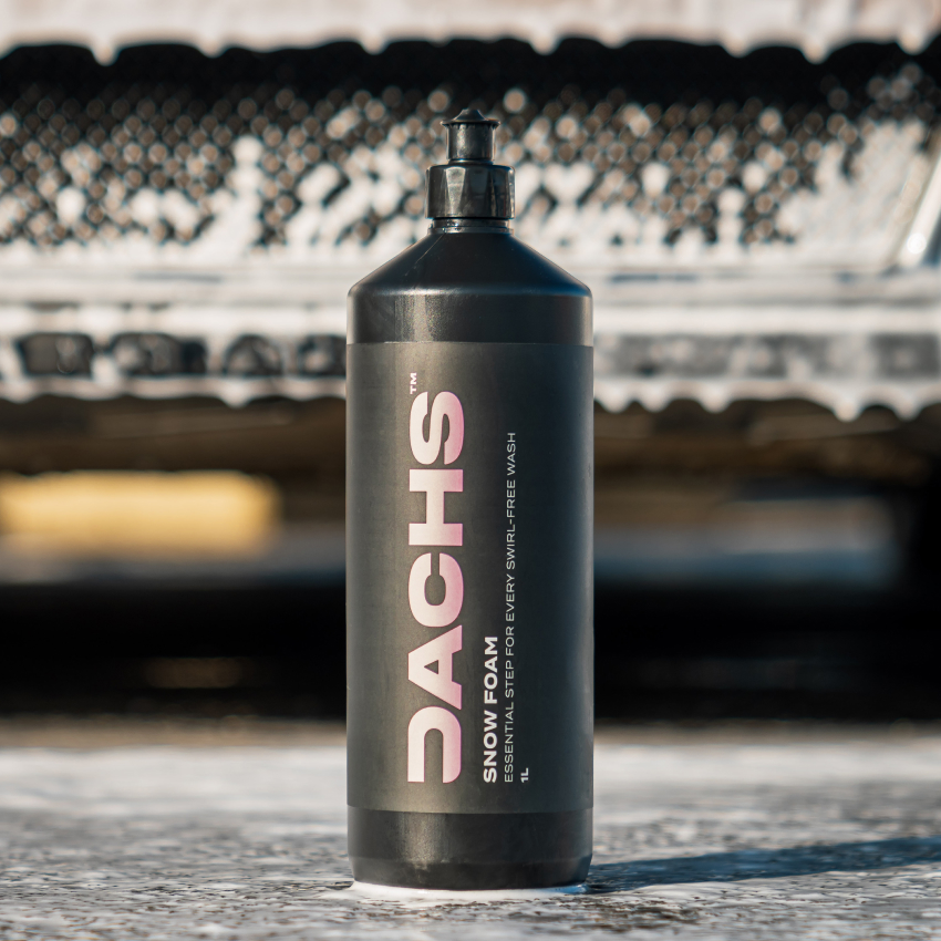
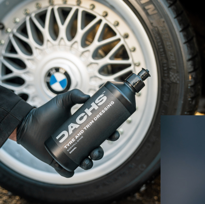
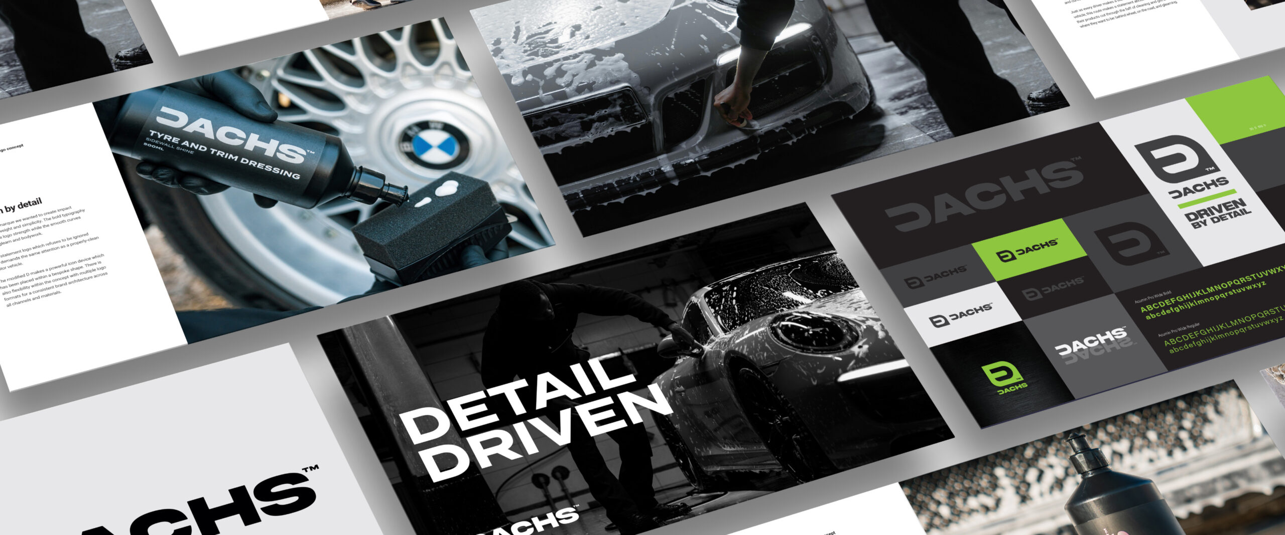
We built Dachs’ identity into a clean, confident brand system. Through sharp typography, tailored textures and standout packaging, we brought their values to life—helping them communicate performance, precision and pride to car lovers who care about every detail.
Client Dachs
IndustryAutomotive
The challenge
Dachs had a powerful product but lacked the branding to match. Their formula delivered a flawless finish, yet the packaging and identity didn’t reflect that. They needed a look that resonated with car enthusiasts, visually bold, technically clear and full of intent.
The Solution
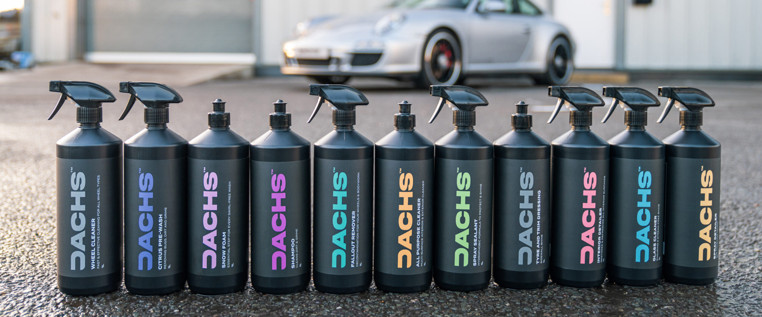
We built a visual identity rooted in performance. Strong, clean typography was paired with textured backgrounds and colour-coded systems to reflect each stage of the process. It’s precise, striking and smart, designed to speak directly to people who take pride in the details.




Keep exploring.
